Contours, Peaks, and Coffee: Crafting a Topographic Identity

Today we dive into topographic branding and visual design for mountain coffee roasters, blending cartography’s precision with the romance of altitude and origin. Expect contour‑line storytelling, elevation‑driven color systems, tactile packaging that feels like a ridgeline, and wayfinding that guides customers from trailhead to cup. We will translate real maps into legible marks, weave altitude into roast language, and celebrate craft that tastes like fresh air at dawn. Join in, ask questions, and imagine labels that breathe thin mountain light.

Mapping Flavor to Elevation

When flavor meets geography, a bag becomes a landscape worth exploring. Elevation numbers stop being trivia and start guiding taste, like a gentle switchback to clarity. By pairing roast notes with readable contours, each package tells where beans grew and how that climb shapes acidity, body, and aroma. Imagine coordinates stamped near the seam, a summit icon for a bright washed lot, and a valley curve for a chocolate‑leaning natural—inviting the hand to trace the route before brewing.

Contour Lines as Flavor Language

Contour spacing can suggest intensity: tight lines for lively, high‑altitude snap; generous spacing for round, low‑altitude comfort. A subtle legend, printed near the valve, decodes lines into mouthfeel while staying minimal. Customers learn intuitively—no jargon, just terrain translated as taste. A small origin silhouette pairs with the contours, so every sip remembers the slope’s angle, rainfall, and morning fog that raised the cherries.

Hypsometric Tints and Roast Levels

Color bands inspired by classic hypsometric tints can map roast progression without clichés. Pale alpine hues for light roasts, mossy midlands for medium, warm canyon ambers for darker profiles. Use clear thresholds and consistent contrast ratios so shelves read like a quick cross‑section. Add a subtle gradient key on side panels, helping baristas and shoppers scan quickly, while digital assets retain exact values across screens and print runs.

Typography Carved by the Ridge

Letterforms can echo granite edges without sacrificing legibility on busy counters. Pair a resilient humanist sans for data with a carved, slightly chiseled display for headlines that feel weathered by wind. Numerals must sing at tiny sizes for coordinates and altitude, while diacritics honor producers’ languages. Build a hierarchy that reads like a trail map: bold summits for primary info, steady trail labels for tasting notes, and quiet captions for sourcing transparency.

Packaging That Feels Like the Trail

Great bags invite touch before they ever pour. Use sturdy, tactile stocks and finishes that mimic relief: gentle deboss for valley floors, crisp foil for snow lines, soft‑touch coatings for cloud cover. Keep structures simple for cafe workflow, but surprise with a fold‑out mini‑map hidden under the closure. Sustainability matters: recyclable valves, mono‑material films, inks that respect waterways. The result feels like gear—useful, durable, purposeful—yet elevates the daily ritual.

01

Tactile Relief with Deboss and Foil

A shallow deboss turns contours into fingertip paths, while a restrained foil stroke picks out a ridgeline that catches morning light. Avoid overprinting textures that muddy legibility; let space breathe. Print a small legend explaining finishes for curious customers. When someone lingers with the bag, tracing lines while waiting for espresso, you have transformed packaging into a quiet pre‑brew meditation that deepens brand memory.

02

Sustainable Stocks with Mountain Character

Use responsibly sourced papers, recycled films, and water‑based inks, then publish specs transparently. Select fibers with subtle inclusions reminiscent of granite flecks, but run legibility tests for fine text. Design tear notches and zippers that reseal reliably for trail days. Include end‑of‑life instructions near the seam. When sustainability reads clearly and behaves reliably, customers feel proud tossing the empty in the right bin after a weekend ascent.

03

Unboxing as a Trailhead Moment

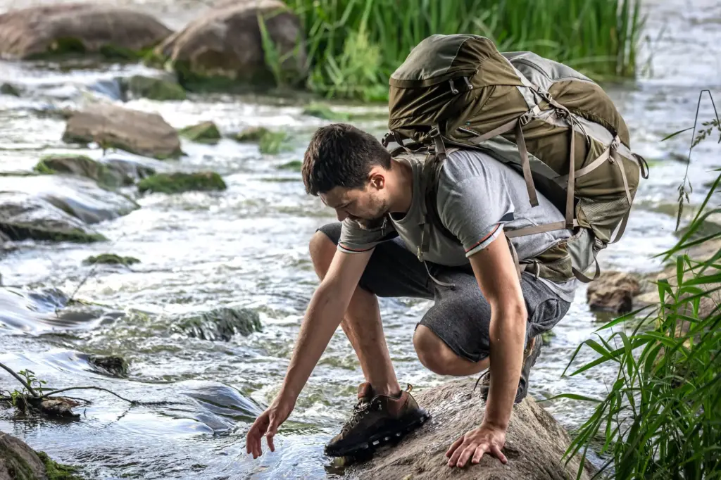
Wholesale cartons can unfold like trailhead boards: a brief route map of the coffee’s journey, safety notes on storage, and a cheerful “brew responsibly” nudge. Inside, slip a weather‑proof brew card tied with biodegradable cord. For DTC, tuck in a small altitude sticker collectors will slap on bottles and helmets. This ritual extends experience beyond taste, building anticipation from doorstep to grinder like the first steps onto crunchy gravel.

Color Systems from Sky to Valley

Build palettes that breathe mountain air. Start with dawn pinks, glacier blues, conifer greens, and basalt shadows, then codify tints that map to roast and origin families. Ensure WCAG contrast for clarity on menus and apps. Align Pantone, CMYK, and HEX so shelves, websites, and delivery vans tell the same sky‑to‑valley story. Leave room for seasonal sunbursts or stormy limited editions without breaking recognition.

Wayfinding for Cafés and Vans

Treat the cafe like a friendly trail network. Clear arrows point to order, pickup, and water. Icons show brew types like little campsite symbols, with coordinates nodding to your flagship’s doorstep. On the road, vans become moving maps, carrying a bold ridge graphic and service information laid out like a legend. Guests navigate by instinct, lingering where light pools and the smell of bloom hangs like morning mist.

Iconography and Pictograms with Purpose

Design a compact set: pour‑over, espresso, batch, decaf, pastries, restrooms, refill station, dog‑friendly areas. Keep stroke weights and corner radiuses consistent with your typography. Test coherence at four sizes, from menu micro‑icons to window decals. When a traveler steps in, symbols should feel like familiar cairns—assuring, quietly delightful, and understood without language. Purposeful icons reduce friction and make hospitality visible.

Environmental Graphics and Murals

A large wall can carry a hero ridge traced from real GIS data of your sourcing region. Add a subtle elevation scale along the baseboard and tiny captions marking partner farms. Murals double as education and photo backdrop, spreading your story. Use durable, cleanable finishes. At night, wash the contours with warm light so lines glow softly, transforming the cafe into a cozy shelter during urban storms.

Data to Design: GIS into Identity

Real terrain adds gravity. Start with elevation datasets, clean them in GIS, and translate contours into brand‑safe vectors. Simplify carefully so lines breathe at print scale, but preserve recognizable silhouettes. Use parametric grids to generate repeatable patterns for linings, wraps, and social posts. Mind licenses and cultural sensitivity when featuring landscapes tied to communities. The outcome honors place, resists cliché, and rewards close looking.

From Elevation Data to Clean Vectors

Ingest DEM sources, filter noise, set contour intervals that suit production thickness, then export to a precise vector workflow. Remove tangles and overlaps, stroke with consistent weights, and test on mock substrates. Print a small pilot run to check fill bleed and foil registration. An hour spent smoothing intersections saves weeks of reprints later, keeping your maps elegant under every light and finish.

Parametric Grids and Generative Patterns

Build a grid that flexes for posters, bags, and menus, anchoring baselines to notional elevation steps. Use generative scripts to vary line density while protecting key landmarks. This balances freshness with recognition, like hiking the same ridge in new weather. Designers gain a reusable kit that speeds campaigns, while customers enjoy subtle novelty that never breaks the cartographic spell holding the system together.

Legal, Ethical, and Cultural Care

Confirm mapping data licenses, credit sources, and seek guidance when representing sacred or protected landscapes. Ask producer partners how they want regions named, pronounced, and framed. Avoid extractive storytelling; emphasize stewardship and shared value. Ethical design is stronger design, creating space for customers to appreciate place without appropriation. Transparency builds long relationships that weather harvest shifts and supply surprises with mutual respect.

Community, Ritual, and Shared Peaks

Invite the Hike: Share Your Coordinates

Offer a tiny field on your subscription portal for home or trailhead coordinates. Periodically select entries to print, with permission, on interior flaps as quiet shout‑outs. This creates joyful serendipity when someone finds their own latitude tucked beside a valve. Encourage short origin memories in comments, knitting customers and producers through genuine place connections that transcend marketing noise.

Subscriber Maps and Early Sketch Access

Offer a tiny field on your subscription portal for home or trailhead coordinates. Periodically select entries to print, with permission, on interior flaps as quiet shout‑outs. This creates joyful serendipity when someone finds their own latitude tucked beside a valve. Encourage short origin memories in comments, knitting customers and producers through genuine place connections that transcend marketing noise.

Feedback Loops that Sharpen the Ridge

Offer a tiny field on your subscription portal for home or trailhead coordinates. Periodically select entries to print, with permission, on interior flaps as quiet shout‑outs. This creates joyful serendipity when someone finds their own latitude tucked beside a valve. Encourage short origin memories in comments, knitting customers and producers through genuine place connections that transcend marketing noise.

Tavosanotelikarolentopalo
Privacy Overview

This website uses cookies so that we can provide you with the best user experience possible. Cookie information is stored in your browser and performs functions such as recognising you when you return to our website and helping our team to understand which sections of the website you find most interesting and useful.